Contact us: ww@blogquizshop.com

The Core Elements of Art are there whenever your have looked at a painting like Starry Night. But what are the Core Elements of Art and what makes them so captivating? You’re not alone. Many people find themselves drawn to certain artworks but can’t quite put their finger on why.

The secret lies in understanding the core elements of art and artistic style. These are the tools artists use to bring their visions to life on canvas, paper, or any other medium they choose.

One important fact you should know is that art isn’t just about talent. It’s about using the core elements in art such as color, line, shape, and texture in ways that speak to us all. Whether it’s the bold colors of a Mark Rothko painting or the intricate lines in a piece by Edgar Degas, each choice an artist makes impacts how we feel about their work.

This blog post will guide you through the Core Elements of Art—breaking down their complex ideas into simple terms—and show how they’re used to create everything from impressionist landscapes to abstract works.

Get ready for an enriching journey through the core elements in art!

Key Takeaways

  • Art uses elements like color, line, shape, and texture to create feelings. These are some of the Core Elements of Art and help make art stand out and share messages without words.
  • Forms add 3D effects to art, making flat images look deeper. Space in art can be positive or negative, playing with viewer’s perspective.
  • The principles of design include balance, contrast, rhythm, and unity. They guide how we see and understand art by organizing its parts well.
  • Colors have big roles in setting moods. Artists mix colors to get new shades and use the color wheel to see how colors work together.
  • Texture adds a real feel to artworks. It can make you think you know how an object would feel just by looking at it.

Core Elements of Art

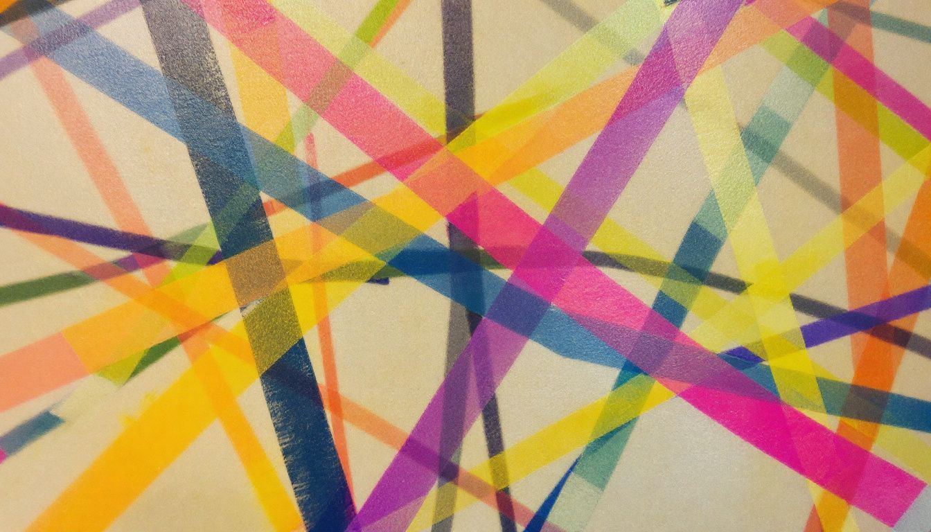
An abstract composition of intersecting lines in various shapes and colors.

The core elements of art form the building blocks for all kinds of visual creations. They include lines that direct the eye, shapes that define objects, colors that set the mood, and textures that add depth.

SHOP NOW ZAZZLE - CLICK BELOW

The Core Elements of Art

The core elements of art are the fundamental visual components artists use to create artwork. These elements are commonly recognized as:

Line, Shape, Form, Space, Color, Value, Texture

Here is a brief description of each element:

  • Line: A mark with length and direction, which can be straight, curved, thick, thin, horizontal, vertical, diagonal, or zigzag. Lines create edges and outlines and can suggest movement or emotion.

  • Shape: A two-dimensional (2D) flat area enclosed by lines or contrasts in color or value. Shapes can be geometric (like squares and circles) or organic (irregular and found in nature).

  • Form: A three-dimensional (3D) object, or the illusion of three dimensions, with height, width, and depth (such as a sphere, cube, or pyramid).

  • Space: The area between and around objects, including the illusion of depth. Space can be positive (filled with something) or negative (empty areas).

  • Color: The visual perception of wavelengths of light, with properties of hue (name of the color), value (lightness/darkness), and intensity (brightness/saturation).

  • Value: The lightness or darkness of a color or tone. Value helps give art depth and dimension.

  • Texture: The surface quality that describes how something feels or appears to feel—like rough, smooth, soft, or hard—either real (tactile) or implied (visual).

Some references may occasionally list additional formal elements, such as pattern or mark making, but the seven listed above are most widely accepted as the core building blocks of visual art

The Core Elements of Art working together to create a Cohesive Composition

The core elements of art—line, shape, form, space, color, value, and texture—work together through strategic arrangement and repetition to create a cohesive composition by fostering harmony, balance, unity, and visual interest within the artwork.

Key ways these core elements of art interact to achieve cohesion:

  • Harmony and Unity

  • Harmony is achieved when elements like color, shapes, and tones complement one another; for example, using shades from the same color family or repeating particular shapes can create a sense of flow and unity in a piece. This allows the viewer’s eye to move naturally through the composition and helps the artwork feel complete and intentional.

  • Balance

  • Distributing elements (such as visual weight, size, and color) evenly across the composition ensures that no single part overwhelms the rest. Balance can be symmetrical or asymmetrical, but always addresses the need for stability and order, making the artwork visually satisfying.

  • Repetition and Rhythm

  • Repeating certain elements—such as shapes, colors, or lines—establishes rhythm and consistency, binding the components into a coherent whole and guiding the viewer’s eye through the work.

  • Variety

  • While repetition provides consistency, introducing variation in elements like color, texture, or shape prevents monotony and adds interest—though too much variety without unifying factors can make the composition feel chaotic. The balance between unity and variety is crucial for both engagement and cohesion.

  • Proximity and Overlap

  • Placing related elements close together or overlapping them strengthens their visual connection and helps group disparate parts into a unified scene.

  • Color Harmony

  • Using a limited or consistent color palette ensures different sections of the artwork relate and support each other, preventing distraction and maintaining focus on the overall composition.

  • Movement and Direction

  • Lines and shapes can be arranged to guide the viewer’s gaze towards focal points or lead them around the artwork, further reinforcing unity and emphasis.

A cohesive composition is achieved not when the core elements of art are uniform, but when they connect meaningfully, reinforcing a central idea or mood and allowing the viewer to experience the artwork as an intentional, harmonious whole.

LineA man walks down a city street with tall buildings.

Lines are everywhere in art. They draw the edge of a shape or the form of a figure. Lines can show movement or make patterns. Artists use lines to guide your eye around their work.

Think about how lines create the soft curves of a face in portraiture or sharp edges in abstract art.

Lines come in many styles—thick, thin, smooth, or jagged. Each kind adds its own feeling to a piece of art. For example, straight lines might give a sense of order and stability.

Curved lines could add softness and motion. In paintings like those by Jackson Pollock, we see action painters using lines to capture energy and movement.

Using linear perspective, artists can create the illusion of depth on a flat surface. This method uses diagonal lines that seem to meet at points far away on the horizon line—like how parallel rails appear to join in the distance on train tracks.

ShapeA woman in her thirties casually explores a creative art studio.

Shape is one of the Core Elements of Art that artists use to define space. They can make shapes look like real things or they can be abstract, meaning they don’t look like anything specific. Shapes are flat and have two dimensions—length and width.

Artists choose between geometric shapes, like squares and triangles, and organic shapes, which are more natural and free-form.

Geometric shapes are precise and regular, such as circles or rectangles. Organic shapes seem more relaxed and mimic the forms found in nature, like the outline of leaves or the curvy shape of a river.

Artists use these different types of shapes to create a sense of order or chaos in their work depending on what feelings they want to communicate.

Moving from shape to color adds another layer of depth to an artist’s work, thus the core elements of art can be employed to achieve effective results …

ColorChildren explore colorful mural in city square, showing curiosity and playfulness.

Color plays a huge part in art. It is one of the Core Elements of Art that can show feelings, make shapes stand out, or blend them into the background. Artists use primary colors like red, blue, and yellow to start a color wheel.

Then they mix these to get secondary colors—green, orange, and purple. But there’s more! By mixing primary and secondary colors, artists create tertiary colors. These include red-violet and blue-green shades.


Colors are the smiles of nature. – Leigh Hunt

In applying the core elements of art, the color wheel helps artists see how colors work together. They learn about warm and cool hues that can change the mood of their art. Saturation tells us how pure a color is—bright or dull tones make different impacts.

Lightness shows if a color looks closer to white or black.

How do repeating colors and shapes strengthen overall harmony in art work?

Two of the core elements of art, colors and shapes, can be repeated to strengthen overall harmony in artwork by creating visual unity and a sense of order, making different elements feel interconnected and cohesive.

  • Repetition of colors

  • When artists use the same or related colors across different areas of a composition, it acts like a visual thread, tying separate parts together and enhancing a sense of continuity. This is called color harmony, and it can be achieved using consistent palettes, analogous colors (colors next to each other on the color wheel), or repeated accent hues. Such repetition prevents the piece from feeling disjointed or chaotic and helps guide the viewer’s eye around the artwork in a pleasing and organized way.

  • Repetition of shapes

  • Using similar shapes or motifs throughout a piece provides unity—making the artwork feel as if all its elements belong together. When shapes echo each other across a composition, they establish patterns and rhythms, reinforcing a cohesive structure. This can occur in obvious ways, such as identical shapes, or more subtly, through related forms or contours that feel naturally connected.

  • Rhythm and flow

  • Repeated colors and shapes create rhythms within the artwork, providing a steady flow that moves the viewer’s gaze smoothly through the composition instead of causing abrupt or distracting transitions. This rhythmic repetition makes the artwork appear intentional and well-balanced.

  • Prevention of monotony

  • Strategic repetition builds harmony without monotony by allowing for gentle variations—slight changes in shade, size, or orientation—while maintaining overall consistency. This keeps the artwork engaging and dynamic while still unified.

In summary, repeated colors and shapes act as the “glue” that holds an artwork together, ensuring all parts relate meaningfully and visually, which is essential for achieving overall harmony.

Texture comes next in the core elements of art…

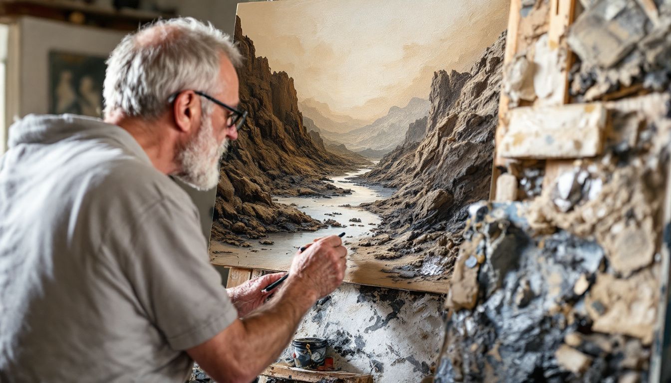
TextureMiddle-aged artist painting rugged, chaotic landscape with thick, textured paint.

Next in the core elements of art is texture as texture in art feels like what things would feel under your hands. Artists use texture to make their work seem real or add emotion. Some areas might be smooth, like a calm sky, and others rough, showing turmoil or chaos.

This mix can pull viewers deeper into the scene.

Artists achieve texture through many ways—painting techniques, materials, even how they apply brush strokes. For example, thick paint makes a canvas feel bumpy or gritty. This physical aspect of art helps convey feelings and stories without words.

Next up is form – another key element that shapes the way we see art.

Additional Core Elements That Enhance Artistic Style

A still life photo of geometric shapes on a textured surface.

In the core elements of art exploring form, space, and value brings depth and life to art. These tools help artists play with 3D effects, fill the canvas in unique ways, and use light or shadows for mood. Dive deeper into how these elements transform simple pictures into masterpieces.

FormA child playing on a colorful geometric playground in the sunset.

Form takes shape to the next level. It gives shapes a 3D structure. Think of spheres, cubes, and cylinders. These forms can pop out in artworks due to shading and perspective. Artists use form to make flat images look like they have depth and volume.


Art is not what you see, but what you make others see. – This quote shows the power of form in art. It makes viewers feel like they can reach out and touch the artwork.

Next up, we talk about space. This element plays with positive and negative areas to create interest in art pieces.

Space

Moving from form to space, we see another vital part of art. In the core elements of art, space in art can be positive or negative. Positive space is where the main parts of the artwork are. Negative space is the area around and between these objects.

Artists use both to make their work more interesting.

They might play with perspective to make a flat surface look deep. This can show off different views or feelings in one piece. Think about how pop artists create busy scenes that pop out at you, using both kinds of spaces cleverly.

Or how abstract expressionists use vast, open spaces to set a mood. Space helps artists tell stories without words, using just placement and perspective.

Value

Value is one of the core elements in art that gives the lightness or darkness of a color. It shows how light falls on things, from the brightest bright to the darkest dark. This element brings depth and mood to the artwork.

Think of a black and white photo; it’s all about shadows and highlights, which is what value is in art.

Artists use the core elements of art, in this case value to create contrast. This makes some parts of their work stand out while others blend in. It helps make flat images look 3D, just like our real world. Light values can show happiness or peace, while dark values might show sadness or mystery.

Next up, let’s talk about form and the principles of Art Design…

Principles of Art Design

A collection of various textured art pieces arranged against a colorful backdrop.

Principles of Art Design shape how we see and feel art. They use balance, contrast, rhythm, and unity to bring out deep feelings and strong visuals in artworks.

They are guidelines that artists use to organize and arrange the elements of art (such as line, shape, color, and texture) in a composition. These principles help create an artwork that is visually appealing and effectively communicates the artist’s intent. The most commonly recognized principles are:

  • Balance

  • The distribution of visual weight in an artwork, ensuring no part feels overpowering or neglected. Balance can be symmetrical, asymmetrical, or radial.

  • Contrast

  • The use of differences (in color, value, texture, shape, etc.) to draw attention and create visual interest in certain areas of the work.

  • Emphasis

  • Creating a focal point in the artwork—a part that stands out and draws the viewer’s eye, often achieved through contrast, placement, or size.

  • Movement

  • Guiding the viewer’s eye through the composition, often using lines, shapes, or sequences of elements to suggest motion or direction.

  • Pattern

  • The systematic repetition of elements in predictable arrangements to create decorative visual effects or background structures.

  • Rhythm

  • The organized repetition or alternation of elements to create a sense of visual tempo or beat, similar to rhythm in music; it gives the composition energy and flow.

  • Unity

  • The sense that all elements in an artwork belong together and create a cohesive whole, often balanced with variety to keep the composition engaging rather than monotonous.

  • Proportion

  • The relationship in size and scale between different elements within the artwork, which affects how natural or balanced a composition appears.

  • Variety

  • Including differences in elements (shapes, colors, textures) to provide interest and contrast, preventing the piece from feeling too uniform or static.

Artists combine these principles in various ways to create successful and compelling artworks. The use and emphasis of specific principles can vary by style, intent, and medium, but all serve to guide the arrangement of visual elements into an effective composition

Emphasis

The principle of art that most effectively guides viewer focus is emphasis. Emphasis creates a focal point in the artwork—an area that stands out and immediately draws the viewer’s attention. This is typically achieved by using contrast, color, size, placement, isolation, or detail to make certain elements visually dominant.

Emphasis works by ensuring the most important part of a composition is noticed first, directing the eye intentionally and making the message or subject clear. Without emphasis, the viewer’s gaze may wander or be confused by competing points of interest. Effective emphasis organizes how the viewer looks at a piece, often using supporting principles—such as contrast or movement—to reinforce the focal point while maintaining visual harmony.

While other principles like movement also influence how the eye travels through a composition, emphasis is specifically centered on commanding attention to a chosen area, making it the most direct and powerful tool for guiding viewer focus.

Balance

Balance is key in art. It makes a picture feel right. Think of it like a seesaw. Both sides need weight to be even. In art, balance can be symmetry or asymmetry.

Artists use balance to guide our eyes through their work. They play with colors, shapes, and lines to create harmony or tension. This pulls us into the world they’ve made.


Balance isn’t about making everything equal; it’s about creating a sense of harmony.

With balance, an artist decides how much attention each part gets. Color plays a big role here too. Bright colors draw more attention than dull ones do. But every choice has its place in making the artwork complete and interesting.

Contrast

Contrast is a big deal in art. It helps things stand out. Artists use light and dark colors to make this happen. Think of a painting where the shadows are very dark, but the light areas shine bright.

This trick grabs your eyes.

Artists like using contrast to show off different shapes too. A circle can pop next to a bunch of squares because it’s different. And colors? Putting opposite ones from the color wheel side by side makes each look brighter.

Blue looks bluer near orange, and red stands out next to green.

How do balance and contrast work together to create visual harmony?

Balance and contrast work together to create visual harmony by blending stability with dynamic interest, ensuring an artwork feels unified yet engaging.

  • Balance involves distributing visual weight in a composition so nothing feels too heavy or awkward. It brings a sense of stability and order, whether the balance is symmetrical (elements mirrored on both sides), asymmetrical (different elements offset each other), or radial (elements radiate from a central point). When balance is achieved, the viewer feels comfortable and at ease, as the composition “feels right.”

  • Contrast introduces difference and variety—sharp changes in color, shape, size, or texture make certain parts stand out. Contrast commands attention, highlights focal points, and injects energy into the piece. It prevents monotony and draws the viewer’s eye to important areas or ideas.

How they work together:

  • Harmony through tension and unity: Too much balance without contrast can make art feel dull or static; too much contrast without balance can cause chaos or confusion. When balance supports areas of contrast, the artwork feels both cohesive and lively—contrast becomes the “spark” within the stable overall “frame.” The interplay ensures there’s a comfortable rhythm that holds everything together while still pointing out what matters most.

  • Directing attention: Well-balanced use of contrast helps guide the viewer’s focus in an intentional way. For example, a single contrasting shape or color set within a balanced arrangement can establish a clear focal point without disrupting harmony.

  • Visual hierarchy and interest: Balance provides the background sense of order, while contrast organizes the hierarchy of what should be seen first, second, and so on. This makes compositions visually pleasing and intellectually clear, allowing messages or emotions to come across effectively.

In summary, balance grounds the composition and contrast enlivens it; together, they achieve visual harmony by marrying predictability with surprise, unity with interest, and calm with excitement.

Rhythm

Rhythm in art is like the beat in music. It guides your eyes to move around the artwork. Artists use patterns, colors, and lines to make this happen. Just as musicians repeat beats, artists may repeat shapes or colors.

This creates a flow that makes the art feel alive.

Take Piet Mondrian’s work for example. He used straight lines and primary colors to create a sense of rhythm. His paintings show how repeating these elements can guide our view across the canvas.

This makes us see order and harmony in his abstract works.

Unity

Unity is like the glue that holds an artwork together. Artists use it to make sure all parts of their work fit well and tell a single story. Think of Paul Cézanne’s still life paintings or Claude Monet’s impressionist scenes.

Their art feels whole because everything in the picture works together.

This principle of art isn’t just about putting things next to each other. It involves balance, color harmony, and sometimes even symmetry or asymmetry to create a feeling of completeness.

For example, using colors from opposite sides of the colour wheel can bring out vibrant contrasts yet tie a piece together through complementary color schemes.

To achieve unity, artists often think about how different elements such as lines, shapes, and textures interact within a space. They might repeat patterns or use similar colors across the piece to guide your eye smoothly from one part to another.

This careful planning makes sure every element supports the overall message or emotion they want to share.

In what ways can these principles be applied to improve art compositions?

In understanding the core elements of art, you can then apply the principles of art design—balance, contrast, emphasis, movement, pattern, rhythm, unity, proportion, and variety—to improve your own art compositions in the following ways:

1. Plan Your Focal Point (Emphasis)

Decide what you want viewers to notice first. Use tools like contrast (a bright color or detailed area among muted tones), size (something larger than the rest), or placement (central or isolated) to create a clear focus for the eye.

2. Balance Visual Weight

Distribute elements so your composition doesn’t feel “lopsided” or top-heavy. You can balance:

  • Symmetrically (mirrored on both sides), for calm and order.

  • Asymmetrically (different but visually weighted equally), for dynamic energy.

  • Radially (from a central point), for harmony and flow.

3. Introduce Contrast Thoughtfully

Make sure different areas stand out from each other. This could be through:

  • Light vs. dark values

  • Warm vs. cool colors

  • Smooth vs. rough textures

  • Simple vs. complex shapes
    Use contrast to break up monotony and highlight what matters most, but keep it under control so your piece doesn’t feel chaotic.

4. Lead the Viewer’s Eye (Movement)

Arrange elements to guide where the viewer looks next.

  • Use lines, curves, or repeated shapes/colors to “point” toward key areas.

  • Suggest movement with direction or sequence, so attention travels naturally across your composition.

5. Create Patterns and Rhythm

Repeat shapes, colors, lines, or motifs to build patterns.

  • Organized repetition (like a row of arches or repeating flowers) adds structure.

  • Rhythm comes from varied repetition—altering size, color, or spacing for a sense of tempo, much like music.

6. Unify with Variety

  • Make sure your elements feel related by repeating colors, shapes, or textures (unity).

  • Add contrast or variation—through different forms, color accents, or unexpected details—to keep things interesting (variety).
    Strike a balance between consistency (so it “hangs together”) and surprise (to engage the viewer).

7. Check Proportion

Pay attention to the relative size and scale of elements. Exaggerate for dramatic effect or realism, but ensure relationships make sense for your artistic intent.

8. Review and Refine

  • Step back and view your composition as a whole.

  • Ask: Is my eye drawn where I want? Does anything overpower or get lost?
    Adjust elements until the principles work together to support your vision.

By consciously applying these principles, your artwork will feel more intentional, engaging, and visually satisfying. This process turns intuition into skill, helping you create compositions that resonate with viewers.

Conclusion

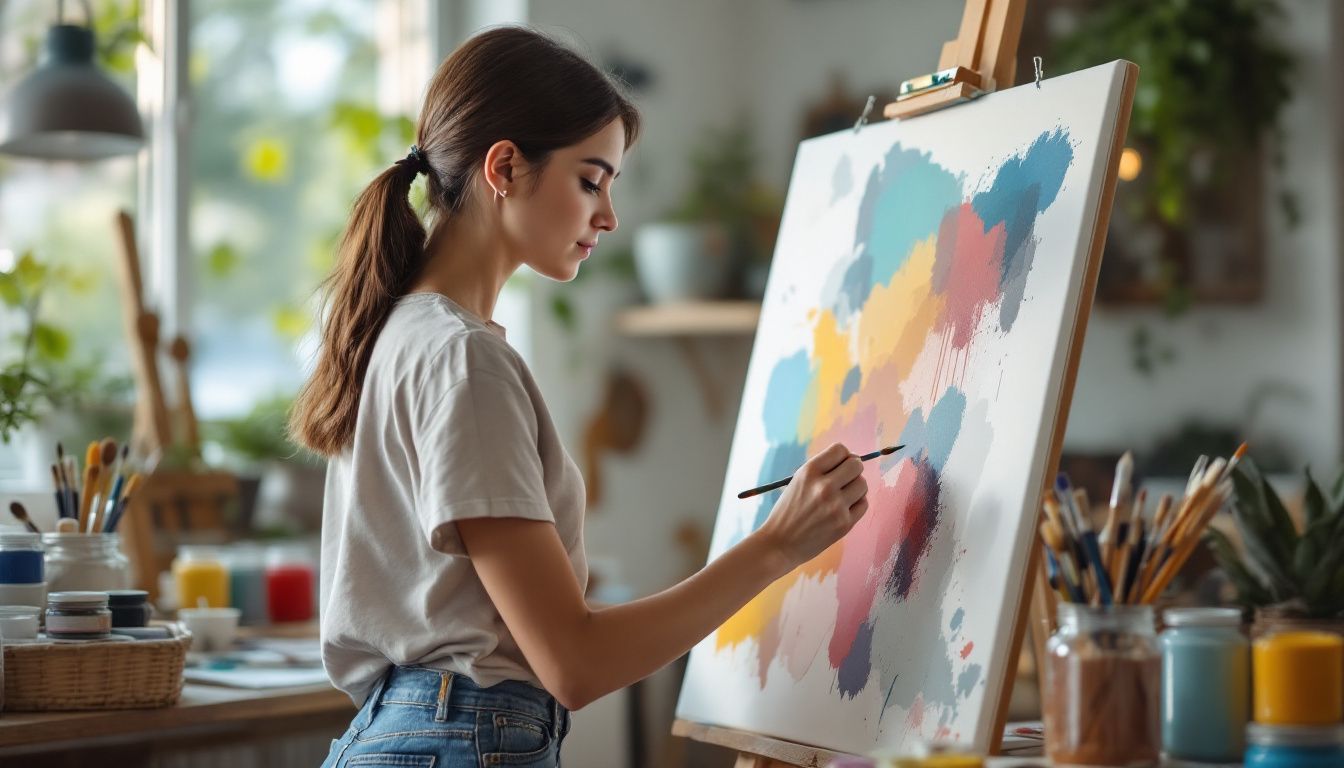
A young woman painting abstract art in a cozy studio.

Art has many parts like color, line, and shape. These help artists make their work stand out. Adding things like form and space makes art even more special. Artists also think about balance and rhythm to pull everything together.

This makes their art not just nice to look at but also deep in meaning.

Understanding these parts helps people enjoy and talk about art better. It’s easy once you know how! Plus, knowing this can show why some paintings or sculptures feel so powerful.

There are many styles in art. Each uses color, lines, shapes, and other parts in its own way. This is what makes each piece unique.

Learning about these elements is a great step for anyone interested in arts. It opens up new ways to see and think about artworks.

So, go ahead—explore these elements in your next museum visit or when looking at pictures online! You’ll see the difference it makes.

FAQs

1. What are some key elements of artistic style in visual art?

Artistic style in visual art is characterized by several elements including colour theory, use of geometrical shapes, and the ability to evoke emotions. It can range from abstract expressionism as seen with color field painters, to hyperrealism that captures lightest details.

2. How do different movements influence artistic styles?

Different movements have had significant influences on artistic styles. For example, the impressionist movement emphasized plein air painting with primary colours while cubism introduced multiple perspectives in a single artwork. The pop art movement incorporated popular culture into visual arts.

3. Can you explain how colour theory plays a role in artistic style?

Colour theory forms an integral part of an artist’s toolkit – it involves understanding the colour spectrum which includes primary colours like cyan, magenta and yellow; secondary or complimentary colors; and tertiary colours derived from mixing these. Artists often use colour wheels for reference and manipulate chroma or saturation to achieve desired effects.

4. Are there any mathematical aspects involved in creating artworks?

Yes indeed! Many artists employ symmetry and asymmetry along with geometrical shapes such as squares for creating balance or tension within their works – mathematics has always been a silent partner in this creative process!

5. Does subject matter play a role in defining an artist’s style?

Absolutely! From grand odalisque by Gericault to still lifes by Edward Munch or Madonna and Child depictions throughout history – subjects chosen by artists often shape their unique styles.

6. Do contemporary artists continue to evolve their styles based on past movements?

Certainly! Contemporary artists like Kehinde Wiley draw inspiration from various sources including surrealism of Salvador Dali’, Cubism pioneered by Picasso, even traditional cultures like Mende people — they then integrate these influences into modern contexts thereby evolving their own distinctive styles.


The Core Elements of Art generated pin 6772
pinit fg en round red 32
Shopping Basket